The most recent quilt is at a stand still. My trip to the LQS about 30 minutes away was a bust. After calling a friend to make the trip with me, we arrived to find the store closed for the holiday week and reopening after the New Year. What a bummer. We had talked of going to another shop about 30 minutes from our homes…but at least 45 minutes from our current location. Her roast in the oven and an extra teenager at our home suggested that we wait for another day.
What to do? What to do? Start another project!
With some of the left over fabric from this project,
Please, I need some opinions about using the blue or white as a background. The plan was the blue, but now I think the white seems more crisp and fresh. This is designed after the Moda Bake Shop quilt Sugar Pop n Change. Soo, not much in the way of fabric left, not enough to make the center square. Some of those best design moments are those that come about from necessity.
Here is the plan:

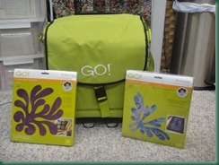
The stripe fabric is going to be the border. These are a couple items that arrived under the tree last week. If 4 of these are cut and arranged in the middle block….that should work. The dark more solid turquoise is a looser woven fabric…it might fray even with wonder under. The other dark turquoise with more green fabric is down to a small bit, but should be still available at the store 10 min. away. That fabric is LQS quality, any opinions. Think about the blue vs. white background fabric. There is enough of the stripe fabric that a block log cabin style or possibly fussy cut and mirror image is an option. The new Go cutter needs some use though. Let me know if you have a preference for the Die on the right or the left.
Can’t wait to hear all the opinions.
Just Another Quilter


I vote white. Both dies are neat and I think both would be great in the middle. Sorry to hear about your failed trip to the LQS. Don't they understand this week is when we all have time off?!
ReplyDeleteWhite for me too. I think it will provide a good contrast (love the other quilt btw). For me, the bigger the square the bigger the die. Fab colours!
ReplyDeleteI like the airy look of the white, and the smaller, daintier die. Of course, what would I know? I've never used them! But I do like the looks! ---"Love"
ReplyDeleteI like the way the white makes the other colours stand out. I really don't have an opinion about the centre though. I'm sure whatever you choose will look gorgeous.
ReplyDeleteI like the white too. While both dies are pretty, I like the one on the left. I know whatever you end up doing it will be beautiful. I love the colors BTW.
ReplyDeleteI agree -- both dies are pretty and the white gives it a clean look!
ReplyDelete